OLD LOGO

NEW LOGO

TRANSFORMATION CONCEPTS
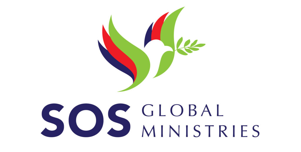
The concept of this logo is inspired by the story of Noah in the Bible. Patients and their families who are experiencing struggles are like getting into a ship that is being swayed by a storm. The dove that flies and returns carrying olive leaf stems In the story, gives meaning: a messenger who brings a new message of hope in the midst of crisis or struggle; a new beginning after a disaster or difficult time.
This logo also contains the SOS Vision, where after a patient is cured or in the process of being cured, he and his family will become agents sent by God as messengers of new hope, especially for people who have experienced similar struggles, and become a blessing for the city, as well as globally. . As symbolized like a dove flying back with an olive leaf stem.
The dove silhouette on the logo is a symbol of the Holy Spirit as a helper in struggles, a symbol of faithfulness as a friend. The flying position symbolizes the position of the person experiencing healing and deliverance.
The three layers on the wings symbolize the concept of a Trinity Godhead, namely the Father, Jesus Christ as the Son of God, and the Holy Spirit, as the source of strength in the SOS ministry. Three layers of green, red, and blue color represent the attitude and character of an SOS waiter. The color green means: life that inspires and tells a story of inspiration, a symbol of life. The color red means: ready, nimble, courageous and passionate. The blue color means: a symbol of faith, trustworthiness, loyalty, bringing truth and peace, and is also a symbol of healing both physically and mentally and in accordance with God’s Word (Romans 12: 2)
In general, the meaning of this logo is “ SENT AS A MESSAGE OF NEW HOPE

